


Consider User Interface (UI) as an independent standalone layer made of small and reusable blocks -> first class citizens of every Angular app. Such an approach is called Component Driven User Interfaces (CDUI), and it encourages creating a library of independent UI components. In this article, we will go through CDUI benefits and learn how to use it together with Storybook – an extremely powerful tool for building UI components in isolation.
What is the purpose of CDUI?
In CDUI, every UI element is treated as an external component, which can be designed, tested, and developed independently from the rest of an application.
The main goals of CDUI are to increase modularity and scalability of applications. It also facilitates the creation of a consistent and maintainable user interface.
By building an application from smaller, self-contained components, the development team can more easily adapt the application to changing business requirements and respond more quickly to potential errors and problems.
What is Storybook?
Storybook is a tool for building, presenting, and testing user interface (UI) components in isolation from the rest of the application. It allows developers, designers and testers to work on individual UI components in an isolated environment without running the entire application.

src: https://prateeksurana.me/blog/react-component-library-using-storybook-6/
Storybook is also an interactive component documentation that can be easily shared and used by entire project teams. Within Storybook, multiple versions and variants of components can be created, filled with various data, and tested in different edge cases for easy debugging and error detection.
One of the main challenges s that Storybook solves is reducing the time required for application development. With the ability to work on individual components in isolation, developers and designers can focus on developing specific components without having to constantly run the entire application.
What do you need before working with Storybook?
To take full advantage of the CDUI approach by using Storybook in a project, the user interface has to be isolated into separated layer of the application. One way to achieve this is to introduce a split of components into:
- components responsible for the presentation layer (presentational components), and
- components responsible for routing and business logic (container components).
It is recommended to introduce the following conventions in the source code to organize this split:
- component naming (e.g. postfix all containers with *-container.component.ts),
- directory structure (place both types of components in different, appropriately named directories, e.g. containers and components)
- module structure (for reusable presentation components create separate modules/libraries, independent from the rest of the application)
- separated interfaces for presentation components (avoid using references to business models directly. An independent interface for each component can be placed in a separate *-foo.interface.ts file right next to the *-foo.component.ts component class file. Interface can also be preceded by a UI-* prefix, such as UiUserDetails).
Here is an example structure containing a folder, which groups modules from the UI layer. The user-details module contains the component with the interface in a separate file.
Depending on the size of the project, the structure can be simplified or more complex.

How to add Storybook to an Angular project:
For an existing project, all you need to do is run a simple command while being in the root directory of the project:
npx storybook@latest init
This will:
- install all external dependencies
- generate configuration files
- add useful scripts in package.json
- create sample storybook stories.
After running the npm run storybook command in the console, we will see this output more or less:
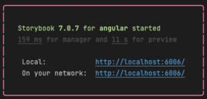
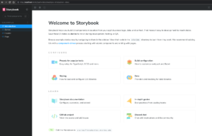
At the indicated address, we will see Storybook running locally, along with a live reload Any component modification will refresh it in Storybook in the browser in real time.
Now let’s return to our user-details component and look at its simple implementation and the interface prepared in a separate file.
// user-details.interface.ts
|
1 2 3 4 5 6 7 8 9 |
export interface UiUserDetails { firstName: string; lastName: string; email: string; avatar: { url: string; alt: string; } | null; } |
// user-details.component.ts
|
1 2 3 4 5 6 7 8 9 10 11 12 |
import { Component, Input } from "@angular/core"; import { UiUserDetails } from "./user-details.interface"; @Component({ selector: "app-user-details", templateUrl: "./user-details.component.html", styleUrls: ["./user-details.component.scss"] }) export class UserDetailsComponent { @Input() user?: UiUserDetails; } |
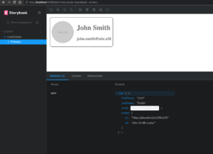
For such a component, let’s create a new user-detail.stories.ts file right next to it.
|
1 2 3 4 5 6 7 8 9 10 11 12 13 14 15 16 17 18 19 20 21 22 23 24 25 26 27 28 29 30 31 32 33 34 |
import type { Meta, StoryObj } from "@storybook/angular"; import { UserDetailsComponent } from "./user-details.component"; import { UiUserDetails } from "./user-details.interface"; // story meta config const meta: Meta<UserDetailsComponent> = { title: "User/UserDetails", component: UserDetailsComponent }; export default meta; // mocks const userMock: UiUserDetails = { firstName: "John", lastName: "Smith", avatar: { url: "https://placehold.it/100x100", alt: "John Smith avatar" } }; // stories type UserDetailsStory = StoryObj<UserDetailsComponent>; export const primary: UserDetailsStory = { args: { user: userMock } }; |
Preparing a meta-object, binding it to a specific UI component, and exporting it as a default value for the file will allow us to display different variants of the components in Storybook.
In the next part, we defined a demo value for the user input (the so-called mock), and in the last step, we defined a specific single story with dedicated data.
All this together already allows us to preview the finished component in Storybook (without running the angular application!):
Extending objects in Storybook:
Above, we presented the simplest possible use-case of Storybook, but the tool allows for much more.
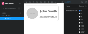
Let’s extend our demo component with an additional parameter (input) notificationCount. That will display the number of pending notifications for the user as long as it is greater than 0.
|
1 2 3 4 5 6 7 8 9 10 11 12 13 |
import { Component, Input } from "@angular/core"; import { UiUserDetails } from "./user-details.interface"; @Component({ selector: "app-user-details", templateUrl: "./user-details.component.html", styleUrls: ["./user-details.component.scss"] }) export class UserDetailsComponent { @Input() user?: UiUserDetails; @Input() notificationCount = 0; } |
This time, instead of hardcoding another demo value in the user-details.stories.ts file, we will use the controls available in Storybook to dynamically change the values passed to the component.
Our meta-object should be extended with an additional property containing the configuration of the interactive controls.
|
1 2 3 4 5 6 7 8 9 10 11 12 |
const meta: Meta<UserDetailsComponent> = { title: "User/UserDetails", component: UserDetailsComponent, argTypes: { notificationCount: { options: [0, 1, 9, 15, 99, 123, 999, 2317], defaultValue: 0, control: { type: "radio" } } } }; export default meta; |
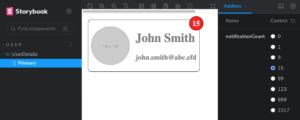
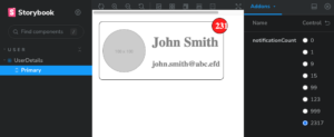
This will allow us to interactively test our component for various possible edge cases and very quickly detect potential errors, such as truncating too-long values:
In real life and real projects, our components are usually much more complicated. Sometimes it may be necessary to import additional dependencies in the meta-object, mock some providers or create many separate stories for a single component.
However, sticking to the previously mentioned rules about making UI components into separated layer, creating and maintaining Storybook for any components is just fast and convenient:
The source code for the above example can be found here:
https://github.com/Herdu/storybook-demo
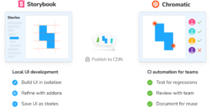
Using the Chromatic tool in Storybook:
Chromatic is a platform that will allow us to squeeze the best out of Storybook. With this tool, we will do the following things in a very simple way:
- Share the ready-to-go component catalog with the rest of the team (including those with non-technical roles). We give the possibility to add comments, thus strongly shortening the feedback loop.
- Perform automated visual regression tests.
- Test the behavior of components in different browsers.
- Create a history of UI changes automatically.
- Integrate everything with CI/CD processes.
src: https://www.chromatic.com/docs/
Adding Chromatic to a project and using it is pretty straightforward. Its benefits reward the effort we put into Storybook.
Summary:
The tools and concepts presented here allow you to put the CDUI concept into practice. The creation of the user interface layer can become a separate, independent task, easily delegated to another developer or even another team. Working on components becomes much faster and more convenient, and testing edge cases becomes even simpler (both at the time of creation and in later stages of development).
Storybook, even in its simplest form, provides a set of working use-cases of each UI component. Using additional extensions,such as addons, we can generate full documentation of our component catalog without additional configuration.
By betting on reusability, we ensure consistency in the appearance and behavior of our application. Going a step further, we can build a component library shared between multiple projects.After all, our UI components have their own interfaces.They do not depend on the business context of a particular application)
Sources:
Storybook’s documentation: https://storybook.js.org/docs/angular/
Chromatic’s documentation: https://www.chromatic.com/
Leave a Reply