


We build new components every day in our Angular application. A few core principles, such as augmenting native elements or utilising the directive selector, could help develop fantastic components. In this post, we’ll go back to the basics to revisit the power of Angular directive selectors in ways that simplify the component’s implementation and improve accessibility.
Components are the most basic UI building block of an Angular app. An Angular app contains a tree of Angular components.
We will look into a rather simple use case and see how augmenting native elements could help.
- Source code and slide
- Creating a custom button component
2.1. Custom button #1
2.2. Custom button #2
2.3. Create a custom button #3 - Global attributes
- Augmenting native elements
4.1. Re-implement three use cases using augmenting native elements approach
4.2. Custom button #1
4.3. Custom button #2
4.4. Custom button #3
4.5. Why does it work?
4.6. Benefits
4.7. Many popular UI libraries use augmenting native elements approach
4.8. What else can you do with augmenting native elements?
4.9. Should we never replace native components with custom components?
Source code and slide
This blog post is based on my recent presentation at NGRome 2022.
- View the original slide → trungk18.com/ngromeconf-2022
- View the demo source code → https://stackblitz.com/edit/angular-directives-use-case
Creating a custom button component
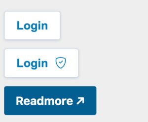
We will create a custom button component with three variants
- A button with simply a text
- A button with text and an icon
- A button with text and an icon, behave like a
<a>tag and open a new URL when clicked.
stackblitz.com/edit/angular-directives-use-case ↗
Custom button #1
That’s the simple implementation for the first requirement that simple can render a button with specific styling and text content.
|
1 2 3 4 5 6 7 8 9 10 11 12 13 14 15 16 17 |
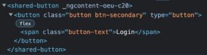
export type ButtonType = 'reset' | 'button' | 'submit'; export type ButtonTheme = 'primary' | 'secondary'; @Component({ selector: 'shared-button', template: ` <button class="button" [ngClass]="'btn-' + buttonTheme" [attr.type]="buttonType"> <span class="button-text">{{ buttonText }}</span> </button> `, changeDetection: ChangeDetectionStrategy.OnPush, }) export class ButtonComponent { @Input() buttonText!: string; @Input() buttonTheme: ButtonTheme = 'secondary'; @Input() buttonType: ButtonType = 'button'; } |
To create a new component in Angular, we usually need at least three parts:
- A selector, in this case, is
shared-button - The template to render when we use our component
- A class that defines the behaviour of our component. In the use case of a button, there isn’t any behaviour needed.
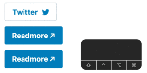
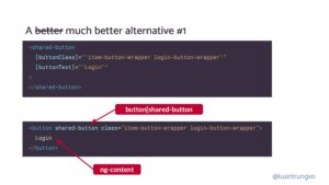
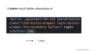
That’s how we use it to render the first use-case, notice that you only need to give the [buttonText] input and we will have the text Login render inside the button for us.
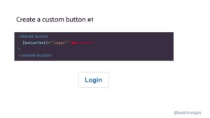
Below is how it gets rendered into the DOM. As we can see there is a shared-button that wraps the real native button
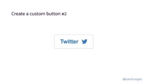
Custom button #2
In the second example, we want to render the text along with an icon. The simplest way to do it is introducing new @Input() icon: string and our shared-button will use this icon to render with our favourite icon library, e.g. material icon. The code could potentially look like this:
|
1 2 3 4 5 6 7 8 9 10 11 12 13 14 15 16 17 |
export type ButtonType = 'reset' | 'button' | 'submit'; export type ButtonTheme = 'primary' | 'secondary'; @Component({ selector: 'shared-button', template: ` <button class="button" [ngClass]="'btn-' + buttonTheme" [attr.type]="buttonType"> <span class="button-text">{{ buttonText }}</span> + <mat-icon [svgIcon]="buttonIcon"></mat-icon> </button> `, changeDetection: ChangeDetectionStrategy.OnPush, }) export class ButtonComponent { @Input() buttonText!: string; + @Input() buttonIcon!: string; } |
However with this implementation, there are always certain constraints:
- We always use
mat-icon - The icon always displays after the text
With that, several questions arise:
- What if I don’t want to use
mat-iconbut used just a font icon with a simple<i>tag? Or sometimes, an image with<img>tag - What if I want to place the icon, then the text?
To support the above requirements, it is so much easier if we can provide both text and icons together as a “template” to the button component. So that the component’s user can decide how he wants to arrange the content, or which icon library he wants to use.
We introduce a new @Input() buttonContent that accepts a TemplateRef instead of just a simple string. We can use something like content projection that does the same thing, however, let’s stick with TemplateRef for now.
|
1 2 3 4 5 6 7 8 9 10 11 12 13 14 15 16 17 |
@Component({ selector: 'shared-button', template: ` <button class="button" [ngClass]="'btn-' + buttonTheme" [attr.type]="buttonType"> <span class="button-text"> <ng-container> {{ buttonText }} </ng-container> + <ng-container *ngTemplateOutlet="buttonContent"> </ng-container> </span> </button> `, }) export class ButtonComponent { + @Input() buttonContent!: TemplateRef<any>; @Input() buttonText!: string; @Input() buttonTheme: ButtonTheme = 'secondary'; @Input() buttonType: ButtonType = 'button'; } |
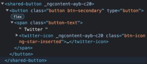
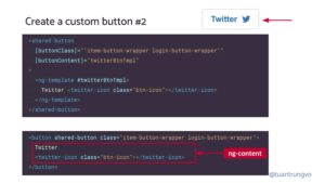
So with the new implementation, it is very flexible since we can essentially decide what template we want to render inside the button: maybe it is just a single icon, maybe the icon appears in front of the text, and in this example, we use a dedicated component twitter-icon. You know what I am talking about.
|
1 2 3 4 5 6 7 |
<shared-button [buttonContent]="twitterBtnTmpl" > <ng-template #twitterBtnTmpl> Twitter <twitter-icon class="btn-icon"></twitter-icon> </ng-template> </shared-button> |
Below is how it gets rendered into the DOM. As we can see there is a shared-button that wraps the real native button as the previous #1 example.
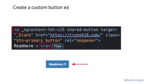
Create a custom button #3
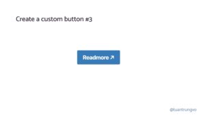
In the 3rd use case, things get a little more interesting. We want to have a link, that looks like a button. A link means when click, it opens an URL.
Looks simple enough, however, the real implementation was a bit more complicated than that.
A link could be either opened using routerLink for an internal Angular route or href for an external URL
- We need to check whether the URL includes
httporhttpsto differentiate between internal and external URL routerLinkcould require some query parameters- If the link is external and open with
href, do we want to open it in a new tab usingtarget="_blank" - We also know that if
target="_blank"appears, we should setrel="noopener noreferrer"toatag for safety reasons. - View the full
shared-buttonimplementation that supports<a>
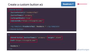
The following code could render our desired button
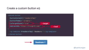
However, the button implementation might have @Input with different attributes that you used to work with e.g. isTargetBlank instead of just target or redirectURL instead normal href
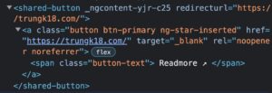
Below is how it gets rendered into DOM, we have our shared-button as usual and inside it renders the <a> as we are expecting.
Also, if you don’t know about the implementation detail at all, it could easily end up in a situation where you render the whole button inside <a> tag to have the same anchor behaviour.
|
1 2 3 4 5 6 7 8 9 10 11 |
<a href="https://trungk18.com/" target="_blank"> <shared-button [buttonContent]="readmoreTmpl" [buttonTheme]="'primary'" > <ng-template #readmoreTmpl> Readmore ↗ </ng-template> </shared-button> </a> |
In this case, the DOM structure will be a > shared-button > button and because both a and button are focusable, pressing Tab will focus into each one of them.
In the screenshot, we press Tab to have a default blue outline because we focus on a, press one more time you’ll see our custom outline because now it gets focused on button
This approach won’t scale very well
In all three examples, our implementation is increasingly its complexity when we need to introduce new functionality. However, what we want at the end is truly simple: apply certain classes to button and a so that it looks the way we want.
For the rest of the code, we are trying to duplicate the functionality of the button and a because they are hidden away within our shared-button component and we couldn’t access it otherwise.
Global attributes
Because we hide our button element from shared-button, if we want to support new button attributes, we will need to introduce one new @Input on our shared-button
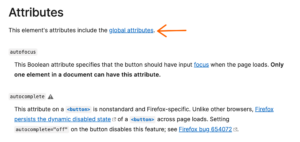
However, each HTML element like button will also come with a list of global attributes ↗ it needs to support.
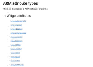
It included all ARIA attributes for making our web more accessible, which includes about 50+ more attributes.
So if our shared-button component suddenly needs to support more attributes, that’s how it might look.
|
1 2 3 4 5 6 7 8 9 10 11 12 13 |
@Input() ariaHidden: boolean; @Input() ariaPlaceholder: string; @Input() ariaPressed: string; @Input() ariaReadonly: string; @Input() ariaRequired: string; @Input() ariaSelected: string; @Input() ariaValueText: string; @Input() ariaControls: string; @Input() ariaDescribedBy: string; @Input() ariaDescription: string; @Input() ariaFlowTo: string; @Input() ariaLabelledBy: string; // and another 100 more Inputs ? |
Augmenting native elements
In angular.io accessibility guide, there is one small section that mentions Augmenting native elements approach.
Native HTML elements capture several standard interaction patterns that are important to accessibility. When authoring Angular components, you should re-use these native elements directly when possible, rather than re-implementing well-supported behaviors.
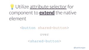
For example, instead of creating a custom element for a new variety of button, create a component that uses an attribute selector with a native
<button>element. This most commonly applies to<button>and<a>, but can be used with many other types of element.From <https://angular.io/guide/accessibility#augmenting-native-elements>
In Angular, augmenting native elements is creating a component that uses an attribute selector to extend the native <button> element.
That’s how the code with augmenting native elements
- Selector: we are not using a custom component tag, instead, we combine
button[shared-button]anda[shared-button]because we don’t want to apply this component to adivfor example. - Template: using purely content projection means we want anything which is between a
buttonora - Then we can apply directly the class we want to the native element using
HostBinding
|
1 2 3 4 5 6 7 8 9 10 11 12 13 14 15 |
@Component({ + selector: 'button[shared-button], a[shared-button]', + template: ` <ng-content></ng-content> `, changeDetection: ChangeDetectionStrategy.OnPush, styleUrls: ['./button-v2.component.scss'], encapsulation: ViewEncapsulation.None, }) export class ButtonV2Component { + @HostBinding('class') get rdButtonClass(): string { const classes = ['button', `btn-${this.buttonTheme}`]; return classes.filter(Boolean).join(' '); } @Input() buttonTheme: ButtonTheme = 'secondary'; } |
Re-implement three use cases using augmenting native elements approach
I show the code side by side so we can have a better comparison. The top is the old approach using a custom shared-button, and the bottom uses our new approach of attribute selector.
Custom button #1
Custom button #2
Custom button #3
Noticed that in all three examples
- What we render into DOM will be the
buttonandawithout a redundant wrapper. - When we are using the selector, we can access to
buttonandadirectly thus it eliminates the need to forward additional attributes. The only@Inputwe accepts so far isbuttonTheme
Why does it work?
Angular directive ↗ selector accepts:
element-name: Select by element name..class: Select by class name.[attribute]: Select by attribute name.[attribute=value]: Select by attribute name and value.:not(sub_selector): Select only if the element does not match thesub_selector.selector1, selector2: Select if eitherselector1orselector2matches.
In our code, we use button[shared-button], a[shared-button] which is the combination of element-name and [attribute] selectors.
Benefits
- Familiar APIs!
- Accessibility win!
- Simpler implementation!
Many popular UI libraries use augmenting native elements approach
Angular Material
material/button/button.ts#L40 ↗️
|
1 2 3 4 5 6 7 8 9 10 11 12 |
@Component({ selector: ` button[mat-button], button[mat-raised-button], button[mat-flat-button], button[mat-stroked-button] `, templateUrl: 'button.html', inputs: MAT_BUTTON_INPUTS, exportAs: 'matButton', encapsulation: ViewEncapsulation.None, changeDetection: ChangeDetectionStrategy.OnPush, }) export class MatButton extends MatButtonBase { |
NG-ZORRO
components/button/button.component.ts#L40
Notice here ng-zorro enhance the template to supply a loading icon as well, not just a simple ng-content anymore.
|
1 2 3 4 5 6 7 8 9 10 11 |
@Component({ selector: 'button[nz-button], a[nz-button]', exportAs: 'nzButton', changeDetection: ChangeDetectionStrategy.OnPush, encapsulation: ViewEncapsulation.None, template: ` + <i nz-icon nzType="loading" *ngIf="nzLoading"></i> <ng-content></ng-content> `, }) export class NzButtonComponent implements OnDestroy, OnChanges, |
What else can you do with augmenting native elements?
Angular Material
|
1 2 3 4 5 6 7 8 9 10 |
@Component({ selector: 'mat-table, table[mat-table]', exportAs: 'matTable', template: CDK_TABLE_TEMPLATE, providers: [ {provide: CdkTable, useExisting: MatTable}, {provide: CDK_TABLE, useExisting: MatTable}, changeDetection: ChangeDetectionStrategy.Default, }) export class MatTable<T> extends CdkTable<T> implements OnInit { |
material/tabs/tab-nav-bar/tab-nav-bar.ts#L307
|
1 2 3 4 5 6 7 8 |
@Component({ selector: '[mat-tab-nav-bar]', exportAs: 'matTabNavBar, matTabNav', templateUrl: 'tab-nav-bar.html', encapsulation: ViewEncapsulation.None, changeDetection: ChangeDetectionStrategy.Default, }) export class MatTabNav extends _MatTabNavBase |
Should we never replace native components with custom components?
No. We need custom components!
However, when you’re creating a new component, you should ask yourself
Can I augment an existing one instead?
Leave a Reply