The Basics:
Spearheaded by the Chrome Aurora and Angular teams, the
Image Directive in Angular was built to improve image loading experience for the web. There is a fantastic article
written over on the Chrome Aurora blog about it. Needless to say loading images is a pretty large part of the web and
can affect a website's Core Web Vitals in major ways. Core Web Vitals are a set of metrics that can be used to
measure the performance of loading a web page. Some of them are directly affected by images and some are indirectly or not affected by images. We will focus on
the ones that directly affect image loading and discuss what the NgOptimizedImage directive is doing internally to accomplish all of these improvements to ensure you are loading
images in the most efficient way possible.
The NgOptimizedImage directive is a standalone directive for Angular that works automatically once you have imported it and have replaced the src attribute on your <img> tag with ngSrc, like so:
import { NgOptimizedImage } from '@angular/common';
import { Component } from '@angular/core';

@Component({
  selector: 'ng-conf-image',
  template: `
    <!-- Will not use the NgOptimizedImageDirective -->
    <img src="angie.jpg" />
    <!-- Will use the NgOptimizedImageDirective -->
    <img ngSrc="angie.jpg" />
  `,
  imports: [NgOptimizedImage],
})
class NgConfImage {}
Even if you do not use every feature of the image directive mentioned in this article, you should still try and use the directive as provided out of the box. Warnings will be printed to the console when in dev mode, providing suggestions that are easy to add to your template.
Core Web Vitals
The main Core Web Vitals (CWV) we are going to discuss and link to the Image Directive functionality are: LCP, DIF, CLS, TTFB, FCP, TBT and TTI. Each one measures a specific part of web application
loading performance. Some of these metrics you may have heard of before, like Largest Contentful Paint (LCP), and some may be more niche and measure something not usually discussed, like Time to First Byte (TTFB).
Let's review what measurements make up Core Web Vitals before we continue on and discuss the specifics of the Image Directive.
- Largest Contentful Paint (LCP) – Measures the time it takes to render the largest image or text block visible in the viewport relative to when the page first starts loading. So if your website has a big image right at the top of the page or above the fold, that image if not configured correctly will drastically affect your LCP in a negative way.
- First Input Delay (FID) – Measures how quickly the browser responds to user interactions. Things that can affect FID are: excessive JS execution, main thread activity (JS is single threaded so excessive main thread activity will delay user actions; images are loaded asynchronously, and modern browsers try to optimize painting of images to minimize user disruption) and network latency. Images do not typically have a direct impact on FID.
- Cumulative Layout Shift (CLS) – Measures how much the elements on the page shift the layout while being rendered. The size (in bytes) of an image does not directly affect the CLS but if they are loaded without dimensions or are replaced with differently sized images (in the case of dynamic placeholders) then that can negatively affect your CLS score.
- Time to First Byte (TTFB) – The amount of time it takes for the browser to receive the first byte of your webpage. This would typically not be affected by images as the first byte being received by a users browser would usually be the
index.htmlthat is served from your web server or CDN (prior to any rendering happening). - First Contentful Paint (FCP) – Images can have a direct effect on the FCP of your website. FCP measure the time is takes for the first piece of content to be rendered. If that happens to be a large image then that will result in an undesirable FCP score.
- Total Blocking Time (TBT) – Images may indirectly affect TBT in certain cases as discussed above in the FID point and the painting of images after they have been loaded.
- Time to Interactive (TTI) – Similarly to TBT, TTI can be indirectly affected by the size of images when the browser is painting them.
The Core Web Vitals that we are going to focus on are: LCP, CLS and FCP, as those are most affected by images. We will see how the Angular Image Directive helps with these metrics and what it is doing internally to accomplish it.
To understand how the Image Directive affects each of the Core Web Vitals and what tools and configurations we have to fine tune image loading, we will go through each of the properties the Image Directive supports.
Some of these properties are native to the <img> tag and built into the browser and some are added on as @Inputs by importing NgOptimizedImage. Each property controls a different part of the image loading
process from network connections to sizing. These are grouped into Priority and Image Sizing sections each with their own subsections digging deeper into the specific attributes.
Priority
Loading and Fetch Priority
First up we have the directive's priority attribute. The priority attribute is the first line of defence against guarding your LCP (and possibly your FCP).
Let's take the image URL https://images.unsplash.com/photo-1417325384643-aac51acc9e5d for example. By default if we render a template like so:
<img
  ngSrc="https://images.unsplash.com/photo-1417325384643-aac51acc9e5d"
  fill
/>
The resulting <img> tag in the DOM will look like this (unrelated properties left our for brevity):
<img
  loading="lazy"
  fetchpriority="auto"
  src="https://images.unsplash.com/photo-1417325384643-aac51acc9e5d"
/>
Notice that our image has loading="lazy" and fetchpriority="auto" set on it. If this is our LCP image we
do not want the browser to be loading the image lazily (since we know that it is going to be required for the page load right away).
It also has the fetchpriority set to auto by default, as this is the browser default if an alternative is not provided. This tells the
browser "load it when you think it is best to load it.", but if we know we need it loaded right away, we should specify that.
In scenarios like these it is much better to be explicit vs implicit. Luckily the Image Directive has built in functionality for this.
By setting the priority attribute on the image tag the directive will automatically set the correct values here to ensure the image is loaded as quickly as possible.
Explicitly telling the browser that this image is a priority to load:
<img
  ngSrc="https://images.unsplash.com/photo-1417325384643-aac51acc9e5d"
  fill
  priority
/>
After the DOM has been rendered:
<img
  priority=""
  loading="eager"
  fetchpriority="high"
  src="https://images.unsplash.com/photo-1417325384643-aac51acc9e5d"
/>
We can now see that loading and
fetchpriority are set to eager and high respectively. This will tell
the browser "load this right away, regardless of where it is on the page, and load this before low priority resources".
This will ensure the image is not competing against resources that are not needed (or those that are less important), thus negatively impacting LCP.
Preload and Preconnect
Now that we have told the browser that this image is important and it should load it right away, Angular is going to
tell us one thing and do another for us automatically to ensure that we are not hindering the browser in pursuit of
the perfect image load.
By default, when using Server-side Rendering (SSR), Angular will automatically add what is called a
preload link to the index.html. This is a <link> tag added
to the <head> element of your rendered application telling the browser to preload this image ahead of time as you will
need it early on in your applications' lifecycle.
Note: Despite the name it does not load anything; it just schedules the resource specified in the
hrefto be scheduled to be downloaded and cached with a higher priority.
The generated preload link tag will look something like this and as previously mentioned will be located near the end of the <head> tag.
<link
  as="image"
  href="https://images.unsplash.com/photo-1417325384643-aac51acc9e5d"
  rel="preload"
  fetchpriority="high"
  imagesizes="100vw"
/>
Note: Notice the
as="image"property on thepreloadlink tag. This is some additional context that Angular is adding to help the browser know what resource is being loaded and thus allowing the browser to optimize the loading process
The other performance improvement that Angular will suggest in dev mode (but not do automatically) is to add a preconnect link tag
to the head so that the browser can connect to the origin that stores your image ahead of time. This makes it so that when the browser does
start to download the image it is already connected to the origin.

Dev mode console warning alerting you to add a preconnect link.
Adding the preconnect link for domains you know you will be connecting to is another case of being explicit vs. implicit
that will result in better performance when rendering images.
So now just by adding the priority attribute to your image tag Angular will:
- Ensure the browser is connected to your image's origin ahead of time
- Ensure the image is downloaded and cached ahead of time before your application even needs it
- Load the image ahead of other less important elements, so it is one of the first elements displayed to your user.
Note: In some cases you may want to ignore the warnings about missing
preconnectlinks for certain origins. This can be achieved by providing a value for thePRECONNECT_CHECK_BLOCKLISTinjection token, the value of this token is in the formatstring | string[]. Example:{ provide: PRECONNECT_CHECK_BLOCKLIST, useValue: 'https://images.unsplash.com' }
What does this look like in terms of network performance?
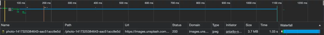
Network water fall with all priority optimizations applied.
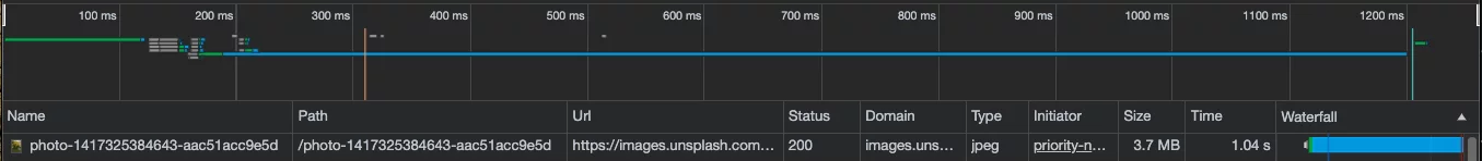
Network water fall without any priority optimizations applied.
That is just over 100ms saved! Caveats here of course are that this is a simple app running on a desktop. This difference would be exacerbated once the app is loading many other elements and is possibly on a slower network (like 3G).
Image sizing
Width, height and fill
To help prevent layout shifts (improving your CLS score) the image directive enforces that you either provide a
width and height value for the image or use the fill attribute tell it to fill the parent container. You'll notice that in the priority
section above we were using fill. This helps if you do not know what size your image is actually going to be on the page but
do know that it will fill the parent container and that container will be sized and laid out correctly on the page.
Using width and height directly will tell the browser how much space the image will occupy, which will allow the browser to lay out the page and prevent your layout from shifting and causing negative CLS scores.
<img
  ngSrc="https://images.unsplash.com/photo-1417325384643-aac51acc9e5d"
  width="100"
  height="100"
/>
Note: One important thing to remember when setting the
widthandheightproperties of an image is that they should always match the intrinsic aspect ratio of the image itself. If it doesn't, the image could appear distorted upon rendering.
Setting width and height is slightly different when you know the image is going to be a fixed size vs responsive.
Responsive images are those that you want to grow and shrink relative to the size of the viewport. When configuring your image
to be responsive it is important to set the sizes attribute of your image. Don't fret, the image directive helps with this as well!
Alternatively, when using fill, the image will completely fill in the parent container. In this example we size a div such that
it is 100px by 100px. This will result in the image also being 100px by 100px when rendered. (This is not necessarily
the size of the image itself that was loaded; we will optimize that later.)
<div style="width: 100px; height: 100px;">
  <img
    ngSrc="https://images.unsplash.com/photo-1417325384643-aac51acc9e5d"
    fill
  />
</div>
The fill attribute is especially handy when you are wanting to display background images. It can be controlled by the object-fit CSS
property on the <img> tag. From the Angular docs:
You can use the object-fit CSS property to change how the image will fill its container. If you style your image with object-fit: "contain", the image will maintain its aspect ratio and be "letterboxed" to fit the element. If you set object-fit: "cover", the element will retain its aspect ratio, fully fill the element, and some content may be "cropped" off.
Let's see what that looks like:
No object-fit CSS applied. The image is just fit within the
container, squishing and messing it up as the aspect ratio does not match
the containers.
object-fit: contain The image is centered and fit within the
container as good as it can without cropping off anything from the x or
y-axis.
object-fit: cover The image is cropped (either x-axis or y-axis
depending on what side is "too big") and fit within the container.
Note: While we will not get too much more into the CSS of this as it works for any images, you can also control the position of the image using the object-position property alongside the
object-fitproperty.
All of the above only changes the size the image is rendered at, not the size of the image that is being downloaded.
So you may be wondering "Well what if I store high resolution copies of all my images on a CDN but only need smaller
versions of them in my web app? Do I still need to download all 4MB of the image just to render it in a 100px by 100px
element?". There is a solution for that!
Sizes and srcset
Choosing the right size of images for your application can have the biggest impact on the speed at which they load. By
providing a sizes attribute in conjunction with an ngSrcset attribute on your <img> tag you can tell Angular what
size of image to use in what cases!
Browsers have an attribute on image tags called srcset. This is an extension of the src attribute and is
meant to provide a variety of image sizes for a single <img> tag, from which the browser will choose the most efficient
image to load. By providing a value to the sizes attribute, the image directive will automatically generate a srcset
for you and set it on the image so when the image is being rendered into the DOM the browser can select and render
the best size of image.
A srcset may look something like this:
<img
  src="https://images.unsplash.com/photo-1417325384643-aac51acc9e5d"
  srcset="
    https://images.unsplash.com/photo-1417325384643-aac51acc9e5d?w=1080 1080w,
    https://images.unsplash.com/photo-1417325384643-aac51acc9e5d?w=400   400w,
    https://images.unsplash.com/photo-1417325384643-aac51acc9e5d?w=200   200w
  "
  sizes="(min-width: 50vw) 1080px,
           ((min-width: 20vw) and (max-width: 50vw)) 400px,
           (max-width: 20vw) 200px"
  alt="A treed park"
/>
This will load the correctly sized image based on how much room (in terms of vw) the image is taking up on the screen.
This may look like a lot to handle for every image in your application but because of Angular and Image Loaders this
becomes very easy. In this example it is pretty easy to tell what size matches what srcset as the px value matches the w (width) property
of each image. This may not always be the case though when looking at the rendered HTML (especially when using custom image loaders).
There should be a 1:1 matching between sizes and srcset image URLs.
Note: Angular provides a default set of responsive breakpoints
[16, 32, 48, 64, 96, 128, 256, 384, 640, 750, 828, 1080, 1200, 1920, 2048, 3840]which you can override yourself by providing theIMAGE_CONFIGin the root of your application with anumber[]array of breakpoints
The most powerful way to leverage sizes and srcset are by using an Image Loader. This answers the question "How do
I serve the right size of image from my CDN?".
An "Image Loader" is a function that is provided to Angular that will format image URLs in a specific format so that
they can be served as efficiently as possible. By leveraging an Image Loader and the srcset attribute, Angular will
automatically generate image URLs for different responsive sizes. Luckily, Angular provide numerous prebuilt image loaders
for popular image CDNs such as: Cloudflare Image Resizing, Cloudinary, ImageKit and Imgix. For this demo, we have been
using Unsplash images, which use Imgix as the service to dynamically resize them.
Previously when we were loading the Unsplash image, the raw size of the image was about 3.7MB, which is way too big
to be loading for every user. We can use the built-in Imgix image loader to reduce this and dynamically size the image
based on what screen size our user is on!
The first step is to add the provideImgixLoader provider to the providers array in either your AppModule or appConfig (if using standalone):
import { ApplicationConfig } from '@angular/core';
import { appRoutes } from './app.routes';
import { provideImgixLoader } from '@angular/common';

export const appConfig: ApplicationConfig = {
  providers: [
    // ...other providers
    // We are using Unsplash here but if you have your own Imgix distribution you should put your own origin here.
    provideImgixLoader('https://images.unsplash.com'),
  ],
};
This will register the Imgix loader across your application so that any time Angular encounters a usage of ngSrc it will
run the image through the image loader (with all other configured properties like sizes and ngSrcset) to build out the
URLs the browser will discover in the <img> tag.
Note: You may be wondering what happens if you pull images from different CDNs and thus need to use multiple image loaders. Unfortunately multiple loaders are not directly supported, but you can always create a custom image loader (discussed below) and conditionally leverage existing built in image loaders or your own logic for building CDN URLs based on the
srcattribute of the<img>tag.
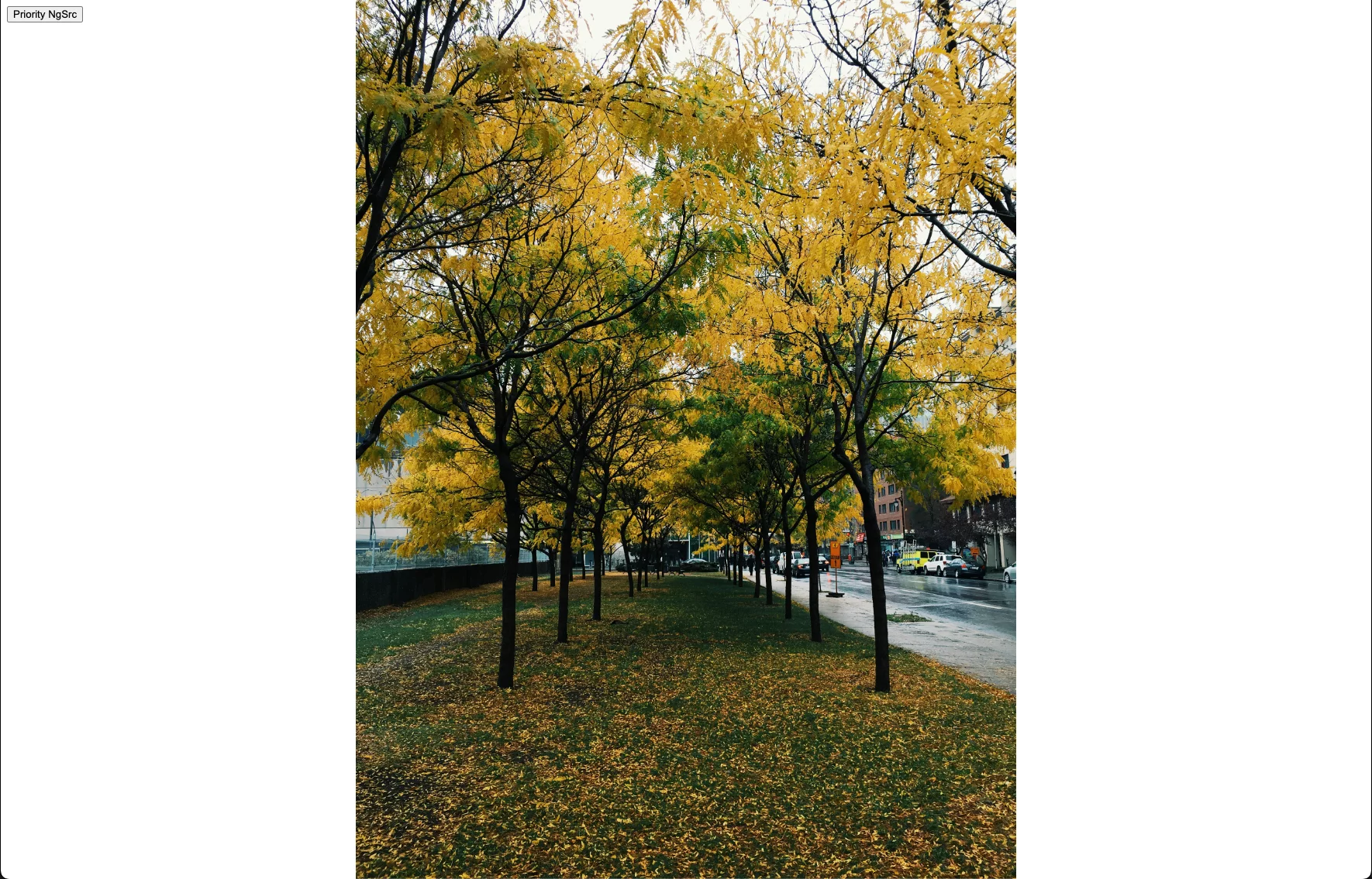
The next step is to use the Image Directive in your template and see the magic!
import { Component } from '@angular/core';
import { NgOptimizedImage } from '@angular/common';

@Component({
  selector: 'ngconf-src-v-ngsrc',
  template: `
    <div style="height: 100%; width: 100%;">
      <!-- Depending on the image loader you are using the value of ngSrc may differ but usually it is the "name" of the image you want to load from your CDN. -->
      <img
        [ngSrc]="'photo-1417325384643-aac51acc9e5d'"
        style="object-fit: cover;"
        fill
        priority
        ngSrcset="300w, 800w, 1500w"
      />
    </div>
  `,
  imports: [NgOptimizedImage],
  standalone: true,
})
export class PriorityNgSrcComponent {}
That is it! Now Angular will be able to generate a srcset for your image based on the size of the viewport! Small viewports
will request an image with width=300, medium width=800 and large width=1500 from the Imgix (Unsplash) CDN!
Below we can see the fully rendered <img> tag that is the result the srcset generation from Angular. This is pretty
amazing, and with the power of CDNs saves us developers a LOT of time making sure images are being sized correctly before
requested.
<img
fill=""
priority=""
style="object-fit: cover;
position: absolute; width: 100%; height: 100%; inset: 0px;"
loading="eager"
fetchpriority="high"
src="https://images.unsplash.com/photo-1417325384643-aac51acc9e5d?auto=format"
srcset="
https://images.unsplash.com/photo-1417325384643-aac51acc9e5d?auto=format&w=300 300w,
https://images.unsplash.com/photo-1417325384643-aac51acc9e5d?auto=format&w=800 800w,
https://images.unsplash.com/photo-1417325384643-aac51acc9e5d?auto=format&w=1500 1500w
"
sizes="100vw"
/>
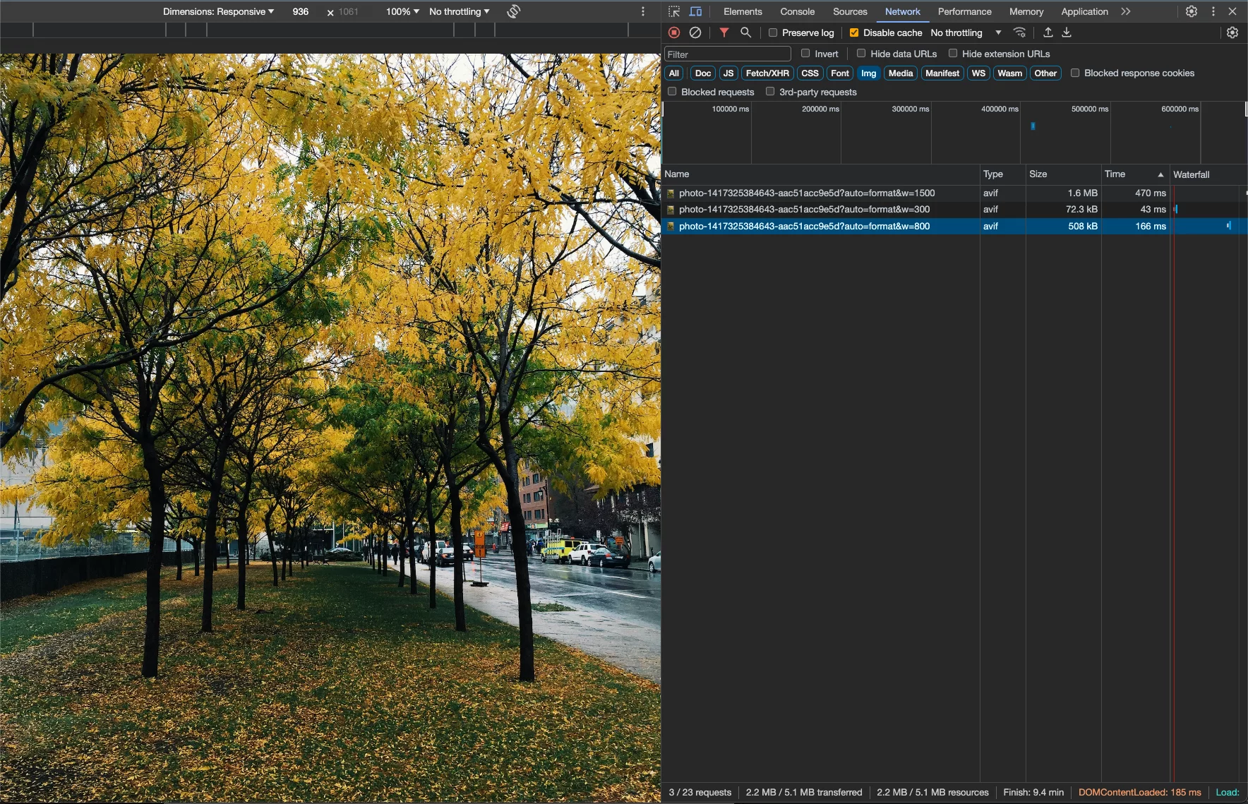
By playing with the responsive settings in Chrome DevTools, we can see the different URLs being rendered, as well as the generated
srcset and image tag:
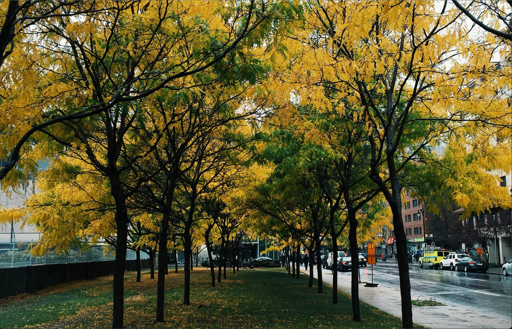
A very small viewport loads the image with width=300, it is only
73kB!
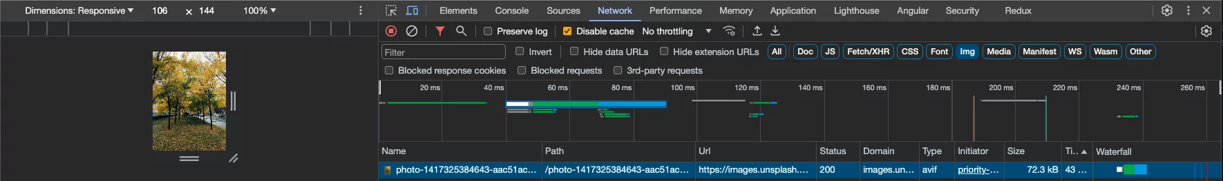
By making it a bit bigger we can see it is now loads width=800, and
has increased to 508kB, which is still a far cry from the 3.7MB originally.
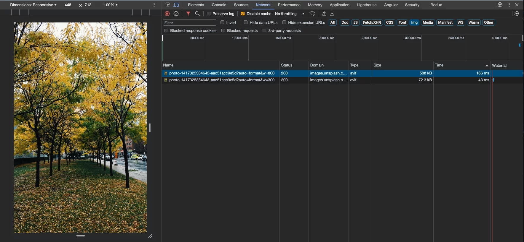
Lastly, on larger screens we are loading the width=1500 which is
still only 1.6MB (still large but less than half the size originally).
The image loader itself is not actually resizing the images, what the loader is doing is it generates different URLs for your image CDN provider based
on the conditions described above. So that your<img>tag displaying your image is set up by the directive in a way that the browser knows what image
to load from your CDN based on the size of the element and the viewport. Your CDN (whether dynamically or ahead of time) will resize and cache the images
being requested by the browser.
Custom Loader
Some use cases may be more complicated than the built-in loaders are able to support. Luckily Angular allows us to provide our own loader implementation for these cases.
Let's build one for Unsplash that also allows us to configure the compression quality alongside the width and height of the image.
The first thing we need to do is define our Image Loader, which is just a simple function that accepts some configurations and returns a string:
import { ImageLoader, ImageLoaderConfig } from '@angular/common';

// The origin of the CDN we are going to use to pull images from.
const base = 'https://images.unsplash.com';

export const myCustomLoader: ImageLoader = (config: ImageLoaderConfig) => {
  // Join the value that the user put in the `ngSrc` attribute and the CDN base into a single URL.
  const url = new URL(config.src, base);

  if (config.width) {
    url.searchParams.set('w', config.width.toString());
  }

  if (config.loaderParams?.['compression']) {
    url.searchParams.set('q', config.loaderParams['compression']);
  }

  return url.toString();
};
Let us break down what is going on here:
- We need to join the src of the image (this is usually a key that references the image, without the domain) and the domain of our CDN.
- If there is a width configured for this image then set the
wquery param (wis thewidthquery param for Imgix) - If we have configured the compression level via loader params (these are additional properties you can pass to the image directive that are passed down into custom image loaders) then set the
qImgix compression query param - Convert it to a string and then return it. This is the string that will end up as part of the
srcsetin the<img>tag.
To register this custom loader in your application, instead of providing provideImgixLoader() in your root, do the following:
import { ApplicationConfig } from '@angular/core';
import { appRoutes } from './app.routes';
import { IMAGE_LOADER } from '@angular/common';

export const appConfig: ApplicationConfig = {
  providers: [
    // ...other providers
    {
      provide: IMAGE_LOADER,
      useValue: myCustomLoader,
    },
  ],
};
This registers your custom loader as the image loader for your application. This will allow you to control the compression for
your <img> tags using the Image Directive now:
<img
  [ngSrc]="'photo-1417325384643-aac51acc9e5d'"
  [loaderParams]="{ compression: 50 }"
  ngSrcset="300w, 800w, 1500w"
/>
This will result in an image tag with the q (compression) query param attached to each of the srcset image URLs in the rendered <img> tag:
<img
fill=""
priority=""
style="object-fit: cover; position: absolute; width: 100%; height: 100%; inset: 0px;"
loading="eager"
fetchpriority="high"
src="https://images.unsplash.com/photo-1417325384643-aac51acc9e5d?q=50"
srcset="
https://images.unsplash.com/photo-1417325384643-aac51acc9e5d?w=300&q=50 300w,
https://images.unsplash.com/photo-1417325384643-aac51acc9e5d?w=800&q=50 800w,
https://images.unsplash.com/photo-1417325384643-aac51acc9e5d?w=1500&q=50 1500w
"
sizes="100vw"
/>
This will have a direct effect on the size of the images that are being downloaded. Of course there is a trade-off between
compression, quality, and speed, so it is up to you to find the perfect combination of these factors!
Results
Now that we have all the configurations and options out of the way let us look at some results! On the left is an image
that is using our custom loader, ngSrcset, preconnnect, preload and all the other goodies that the Image Directive
handles for us automatically. On the right is that same image but just its raw URL being loaded.
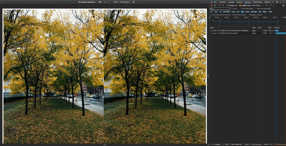
Page load comparison between the raw image URL and using the Image Directive
with every optimization enabled.
Let's go through the numbers now!
| | Raw | Optimized | Change |
| ———— | —— | ——— | —— |
| Size | 3.7MB | 1.0MB | -73% |
| Loading Time | 1300ms | 452ms | -65% |
Wow!

And how easy is it for us to do this moving forward now that we have everything setup? Here is the entire Component:
import { Component } from '@angular/core';
import { RouterModule } from '@angular/router';
import { NgOptimizedImage } from '@angular/common';

@Component({
  standalone: true,
  imports: [RouterModule, NgOptimizedImage],
  selector: 'ngconf-image-directive-article-root',
  template: `
    <div class="container">
      <!-- Image on the left, all the optimizations -->
      <div class="image">
        <img
          [ngSrc]="'photo-1417325384643-aac51acc9e5d'"
          [loaderParams]="{ compression: 50 }"
          fill
          priority
          ngSrcset="300w, 800w, 1500w"
        />
      </div>
      <!-- Image on the right, no optimizations -->
      <div class="image">
        <img
          style="height: 100vh; width: 50vw"
          [src]="'https://images.unsplash.com/photo-1417325384643-aac51acc9e5d'"
        />
      </div>
    </div>
  `,
  styles: [
    `
      .container {
        display: flex;
        height: 100%;
        width: 100%;
      }

      .image {
        flex: 1;
        height: 100vh;
        width: 50vw;
        position: relative;
        object-fit: cover;
      }
    `,
  ],
})
export class AppComponent {}
To wrap it all up here is what the Image Directive is either doing for us automatically or enabling us to easily implement:
preconnectlink in<head>: Preps the browser to download images from the origin.preloadtag for the images marked aspriority, added on the server during the SSR process, so the
download is started as soon as the browser receives the Angular appsindex.html(before Angular even bootstraps).- Automatically
filling the image to the parent container so we do not need to worry about definingwidthandheight. srcsetgeneration so the browser can pick the most optimal image.priorityattribute configurations to ensure the browser is loading the priority images at the right time (loadingandfetchpriority).
That is a LOT to get out of the box with very minimal effort!
Conclusion
There you have it, a deep dive into how the Angular NgOptimizedImage directive works and all the tools it provides you.
If you want to learn more the Angular Docs are fantastic, and I also gave a
talk on this at Angular Tiny Conf 2023 – Shemu if you would rather watch.
The Image Directive is a super powerful tool that was shipped around the release of a lot of other amazing things in the
Angular framework so it got overshadowed. But the benefit it provides to you and the improvements to your Angular application are huge.